I had to interview someone relevant to an industry in which I wanted to pursue a career in. Thus, I looked at local creative design studios in the area and came across Yes Creative. I contacted them asking if they would be up for being interviewed and they were more than happy to help me out.
I emailed across the questions mentioned in the previous section to give them a heads up as to what would be asked so that they were comfortable with them and were able to formulate an answer.
At this point, it came down to just organising a time that was suitable to be able to take the photographs. In preparation of this, I already had an idea in my head as to the types of shots that I wanted so I loaned out a 50mm and a 24-105mm lens from the Universities Photography loan store. The 50mm lens was used for the close up shot and was perfect for this as it allowed the focus to be more selective. The 24-105mm lens was used for the wide angle shot and allowed me to frame the entire office space. This allowed me to use the aesthetics of their office as the main design theme of the piece.
During my time at the Yes Creative studios, despite having an idea already planned, I made sure to take multiple photos in different poses and from different angles to give myself more options when it came to editing.
Below you’ll find examples of some of the photos that were taken that were good enough to be used.


I thought that all of the photos were above were okay and either focus and portray more of the target of the interview but didn’t allow me much space to implement my planned idea regarding space for text.
Which led me to use the following two photos:


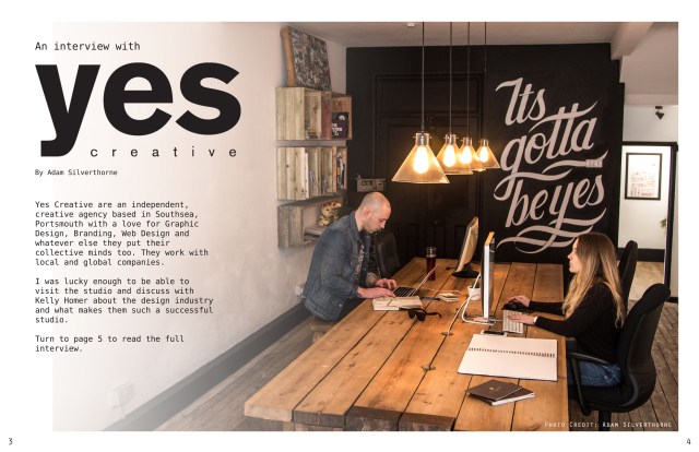
The wide angle shot allowed me to use the white space of the wall to apply text to the image it also featured the studio in more of a professional setting in a working environment.
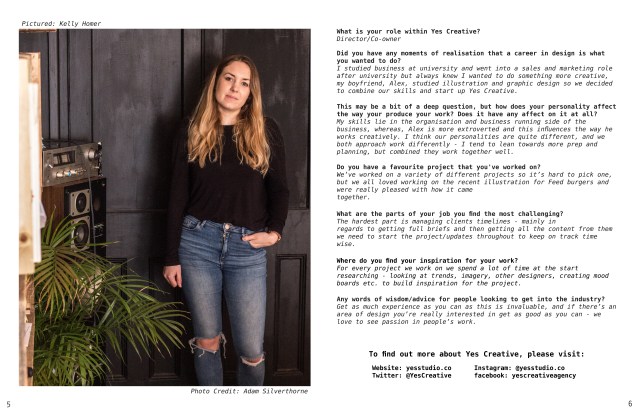
The closer image was more of an interesting shot than the others and showed off more of the targets personality. It also included some of the aesthetic of the studio were helps to keep the theme between the two images. Within this image, accidentally included is their dog in the bottom left of the photo. Originally, I thought about keeping it in the final image but it was too distracting so had to cut the image. This turned out to be the correct decision as it helped to keep the aesthetic and focus on the interviewee.
In order to get to the final product, I had to create the layout for the magazine. Due to familiarity reasons and knowing that I wanted to add some affects to the images, I chose to do this in Adobe Photoshop instead of a software program like Adobe InDesign.
I started by using the ruler feature in Photoshop to create guidelines as to where the middle of the page and printing run offs would be. This allowed me to better frame the images and use the space on each page better.

I then placed the image amongst the grid lines making sure that the content stayed out of the spill areas and applied a layer mask to it. After selecting the layer mask, I chose the gradient tool and using the black and white colours, applied a gradient effect over the top of the photograph. This created the effect on the left side of the image which helps to draw more attention to the rest of the photo and create more white space for text.

Luckily, the logo featured on their website was a large .PNG file so I was able to place the logo into the composition with no problem and it fit into the white space perfectly with no need to resize.
Using the Text tool and multiple layers, the text was added onto the image. I matched the colour of the font to that of the logos (#221f1f) to keep the colour themes the same throughout.

I chose the font “DejaVu Sans Mono” because it gave a professional and minimal look to keep in theme with the aesthetic and certain letters like the “y” match the “y” in the logo. It also has the options to change it between “book”, “oblique”, “bold” and “bold oblique” which was especially useful for the second image containing the interview transcript so that it helps to distinguish between speakers.
Regarding the second image, the process was much simpler and involved me duplicating the first image to keep the same grid system. I then placed the cropped portrait of the interviewee within the grid on the left side. I then used the Text tool again to add the questions into the grid on the right side and made sure to include social media promotions for Yes Creative.
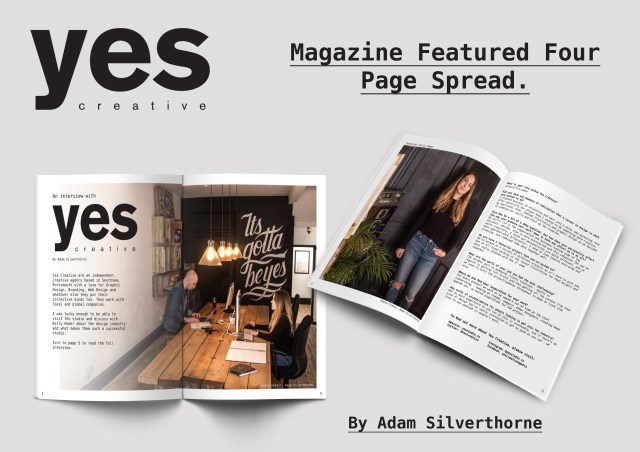
After applying the finishing touches to both images such as page numbers and photo credits for added authenticity, the final images were complete as seen below.